Visual identity
PONRA
Brand identity: logo, colour system, art direction

Brief
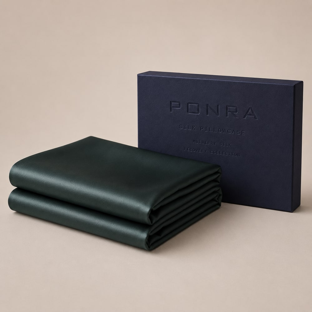
A brand that did not exist yet. No existing site to rebuild, no image library to draw from — just a name and a direction. Everything people would need to recognise first had to be conceived: what it is called, what it looks like and what it is actually about. And it had to work not just in one polished image, but everywhere: on a screen, on packaging and in a photo taken by someone else next year.
Approach
We started with the brand mark and built a system from there, rather than simply delivering a standalone logo. A logo alone is an image; a brand is a set of rules that holds up when you are not there. That means a colour palette that works just as well on a screen as on cardboard, typographic guidelines that define how copy should look, and art direction that sets the tone for future imagery. Everything is documented and set up so that a photographer or printer who has never seen the brand before can use it straight away. Recognition therefore depends on the system, not one person.
Result
- Logo mark with an accompanying documented colour system
- Typography rules and art direction documented for reuse
- Works on screen, packaging and product imagery without adjustment
- Transferable: also suitable for an external photographer or printer